
July 03, 2010 Re: D web site facelift | ||||
|---|---|---|---|---|
| ||||
 Posted in reply to Michel Fortin | On Friday 02 July 2010 19:29:04 Michel Fortin wrote:
>
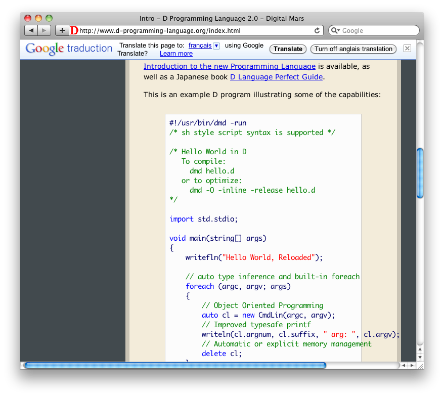
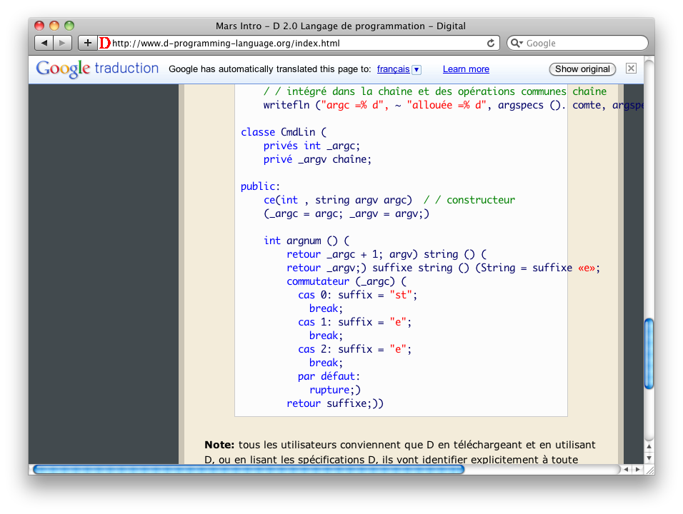
> http://michelf.com/img/shots/d-website-1.png http://michelf.com/img/shots/d-website-2.png http://michelf.com/img/shots/d-website-3.png
>
> (Note: the last one is quite funny if you can read French, but perhaps
> also if you can't.)
I think that it would be funny either way, but being able to read French does give you some clue as to why it replaces what with what. And lacking proper context, with words like switch, it's likely to pick entirely the wrong word even if you _were_ looking to translate all of the kewords into French. It is certainly funny though.
- Jonathan M Davis
| |||
 Permalink
 Reply
Reply
July 03, 2010 Re: D web site facelift | ||||
|---|---|---|---|---|
| ||||
 Posted in reply to Walter Bright | Walter Bright wrote:
> David Gileadi was kind enough to spend some time redesigning the look of the D web site. A preview of it is up on d-programming-language.org. This isn't about the content, just the look/style/feel.
>
> Comments welcome.
I think it's light years ahead of what's there now and will lift the professional image and marketability of D.
Fonts are just fine for me, as is sidebar menu contrast. It focuses attention on what matters, the page content, whilst not detracting from the navigability. Good, balanced use of negative / white space - far too many programming and technical sites assault users with a wall of text and links. This is great.
| |||
July 03, 2010 Re: D web site facelift | ||||
|---|---|---|---|---|
| ||||
 Posted in reply to Walter Bright | "Walter Bright" <newshound2@digitalmars.com> wrote in message news:i0m1qa$2vad$1@digitalmars.com... > David Gileadi was kind enough to spend some time redesigning the look of the D web site. A preview of it is up on d-programming-language.org. This isn't about the content, just the look/style/feel. > > Comments welcome. > > Please don't put links to anything other than the front page yet, as the organization may change. Oooohh, pretty :) A few notes: Text size is the absolute biggest it can get without it being "too-fucking-big". Personally, I'd even bring it down one notch, but as-is is acceptable. *Definitely* do *NOT* go any bigger, though (this isn't Fisher-Price Publishing). The red glow is very nice, but I agree with the others that it decreases the contrast too much and makes it hard to read or look at. In fact, even without the red glow, the menu doesn't have enough contrast and it hurts my eyes. The text-color in the search box needs to be set to black, not system-default. It's nearly-invisible for me on all the browsers I tried: IE7, FF2 and Iron (it's like Chrome, except with changes that make me allow it to actually touch my computer). BIG PROBLEM: In IE, the body-text is nearly invisible. (Pet peeve: When will people learn that *EVERY* time you set a background color, you *MUST ALSO* set a foreground color and vice-versa??? I see that ignored absolutely all the time. This should be basic, basic Design-101 stuff...) See screenshot: http://www.semitwist.com/download/newDSiteIE.png I didn't see any of the glitchiness or google-translate stuff that other people saw (on IE7, FF2, or Iron). Although, from the screenshot someone else posted of the translate-bar, I'm glad it's not showing up for me. (I really wish people would stop loading up their pages with Google's crap.) | |||
July 03, 2010 Re: D web site facelift | ||||
|---|---|---|---|---|
| ||||
Posted in reply to Nick Sabalausky | "Nick Sabalausky" <a@a.a> wrote in message news:i0mi47$mhi$1@digitalmars.com... > "Walter Bright" <newshound2@digitalmars.com> wrote in message news:i0m1qa$2vad$1@digitalmars.com... >> David Gileadi was kind enough to spend some time redesigning the look of the D web site. A preview of it is up on d-programming-language.org. This isn't about the content, just the look/style/feel. >> >> Comments welcome. >> >> Please don't put links to anything other than the front page yet, as the organization may change. > > Oooohh, pretty :) > > A few notes: > > Text size is the absolute biggest it can get without it being "too-fucking-big". Personally, I'd even bring it down one notch, but as-is is acceptable. *Definitely* do *NOT* go any bigger, though (this isn't Fisher-Price Publishing). > > The red glow is very nice, but I agree with the others that it decreases the contrast too much and makes it hard to read or look at. In fact, even without the red glow, the menu doesn't have enough contrast and it hurts my eyes. > > The text-color in the search box needs to be set to black, not system-default. It's nearly-invisible for me on all the browsers I tried: IE7, FF2 and Iron (it's like Chrome, except with changes that make me allow it to actually touch my computer). > > BIG PROBLEM: In IE, the body-text is nearly invisible. (Pet peeve: When will people learn that *EVERY* time you set a background color, you *MUST ALSO* set a foreground color and vice-versa??? I see that ignored absolutely all the time. This should be basic, basic Design-101 stuff...) See screenshot: http://www.semitwist.com/download/newDSiteIE.png > > I didn't see any of the glitchiness or google-translate stuff that other people saw (on IE7, FF2, or Iron). Although, from the screenshot someone else posted of the translate-bar, I'm glad it's not showing up for me. (I really wish people would stop loading up their pages with Google's crap.) > Also, FWIW, this is how it looks in my normal browser (FF): http://www.semitwist.com/download/newDSiteFF.png | |||
July 03, 2010 Re: D web site facelift | ||||
|---|---|---|---|---|
| ||||
 Posted in reply to Robert Jacques | On Fri, 02 Jul 2010 23:08:11 -0400, Robert Jacques <sandford@jhu.edu> wrote:
> On Fri, 02 Jul 2010 20:55:33 -0400, Walter Bright <newshound2@digitalmars.com> wrote:
>
>> David Gileadi was kind enough to spend some time redesigning the look of the D web site. A preview of it is up on d-programming-language.org. This isn't about the content, just the look/style/feel.
>>
>> Comments welcome.
>>
>> Please don't put links to anything other than the front page yet, as the organization may change.
>
> Generally, looks good.
> 1. I concur that medium-light gray on medium-dark gray is too low contrast. However, I find the red bloom in the upper left corner, which also reduces contrast, to be a greater hindrance to readability. Text size seems fine by me.
> 2. The sub-menus (i.e. articles, language reference, etc.) are gliching with opera 10.53 when zoomed. Part of the screen literally doesn't refresh properly when scrolling and/or switching tabs. This only occurs after you've entered at least one menu after zooming.
Some second thoughts.
The translate page select language combo box is lagging in it's rendering. First select language seems to appear and then the combo box after, which changes the control size. This control also seems fairly low on the page and tends to interfere with the text. Perhaps the translate portion can go on the left (as per the old site) and the wiki button raised higher on the page or into the header section. Also, "Add to or comment on this page on the wiki" seems verbose.
The search field is rounded but the combo isn't and is very close to it, giving the pair an odd look. Perhaps the combo box should be centered beneath the search field.
The placement of the DigitialMars/D logo is a little odd. I tried mocking something up in paint, with "Digital Mars" moved left into the corner position and "D Programming Language 2.0" moved right into the header space and learned that to do that you'd really want to re-work the Digital Mars logo a bit.
Also, I just ran into a much more major bug between the webpage and Opera 10.53, though it seems to be an actual bug in opera and may not be consistent.
| |||
July 03, 2010 Re: D web site facelift | ||||
|---|---|---|---|---|
| ||||
 Posted in reply to Walter Bright | Walter Bright wrote: > David Gileadi was kind enough to spend some time redesigning the look of the D web site. A preview of it is up on d-programming-language.org. This isn't about the content, just the look/style/feel. > > Comments welcome. > > Please don't put links to anything other than the front page yet, as the organization may change. In FireFox on Windows, with a screen resolution of 1920x1200, if I open the page with the window maximized, then the bottom of the translate box is behind some of the text. The problem disappears if I shrink the window a bit and then maximize again. http://aldacron.net/img/dsiteff.png | |||
July 03, 2010 Re: D web site facelift | ||||
|---|---|---|---|---|
| ||||
 Posted in reply to Walter Bright | On Sat, 03 Jul 2010 03:55:33 +0300, Walter Bright <newshound2@digitalmars.com> wrote: > David Gileadi was kind enough to spend some time redesigning the look of the D web site. A preview of it is up on d-programming-language.org. This isn't about the content, just the look/style/feel. Because no one thought to do this yet: http://browsershots.org/http://www.d-programming-language.org/ Now, what's everyone complaining about font sizes? Except for the citation block, the font size looks pretty much the same to me on all screenshots (except on Firefox 2.x, where they're slightly smaller - you're not using that obsolete browser, are you?). As for my opinion: I like it. I think the faded red background gives the website a nice, warm look. I agree that the contrast of the left navigation column is probably a problem for some people, though. So we can sort this problem faster by testing actual proposals: those who complained about the menu contrast, does this look better to you? http://dump.thecybershadow.net/86eda81285b762eaaa8dff9b29323b9d/brigher_nav.png (Font color changed to #ccc, hover color to #eee). Also, please do not add JavaScript page elements that change the page layout when loaded. When the Google Translate and "reddit this" buttons finish loading, they expand the size of their container, which shifts/rewraps the page on the text - which is annoying if I already started reading it. (At the very least, fix the size of the floating container box, so its size stays constant.) -- Best regards, Vladimir mailto:vladimir@thecybershadow.net | |||
July 03, 2010 Re: D web site facelift | ||||
|---|---|---|---|---|
| ||||
 Posted in reply to Walter Bright | On 03.07.2010 02:55, Walter Bright wrote: > David Gileadi was kind enough to spend some time redesigning the look of the D web site. A preview of it is up on d-programming-language.org. This isn't about the content, just the look/style/feel. > > Comments welcome. > > Please don't put links to anything other than the front page yet, as the organization may change. I think the new page looks great. Font sizes are fine for me, definitely not to small. A few things to look at, though: -The favicon: Doesn't fit to the new style of the site -The "Add to or comment on this page on the wiki" box: It sometimes hides text of the page, i.e on "D Complex Types vs C++ std::complex" http://tinypic.com/view.php?pic=xlecs1&s=6 -The "Template Comparison" layout is broken here: http://tinypic.com/view.php?pic=14j27p3&s=6 -- Johannes Pfau | |||
July 03, 2010 Re: D web site facelift | ||||
|---|---|---|---|---|
| ||||
 Posted in reply to Walter Bright | On 03/07/2010 02:55, Walter Bright wrote:
> David Gileadi was kind enough to spend some time redesigning the look of
> the D web site. A preview of it is up on d-programming-language.org.
> This isn't about the content, just the look/style/feel.
>
> Comments welcome.
>
> Please don't put links to anything other than the front page yet, as the
> organization may change.
Excellent L&F. Thanks David.
- Remove the funny D(uff) man with a profession D Logo.
- The Library reference should support the same L&F
bjoern
| |||
July 03, 2010 Re: D web site facelift | ||||
|---|---|---|---|---|
| ||||
 Posted in reply to Vladimir Panteleev Attachments:
| Vladimir Panteleev wrote: > On Sat, 03 Jul 2010 03:55:33 +0300, Walter Bright <newshound2@digitalmars.com> wrote: > >> David Gileadi was kind enough to spend some time redesigning the look of the D web site. A preview of it is up on d-programming-language.org. This isn't about the content, just the look/style/feel. > > Because no one thought to do this yet: > > http://browsershots.org/http://www.d-programming-language.org/ > > Now, what's everyone complaining about font sizes? Except for the citation block, the font size looks pretty much the same to me on all screenshots (except on Firefox 2.x, where they're slightly smaller - you're not using that obsolete browser, are you?). > The problem is that font sizes are a personal preference. The main text of the page should be left at the default in order to pick the size from the user settings. > Also, please do not add JavaScript page elements that change the page layout when loaded. When the Google Translate and "reddit this" buttons finish loading, they expand the size of their container, which shifts/rewraps the page on the text - which is annoying if I already started reading it. (At the very least, fix the size of the floating container box, so its size stays constant.) > +1 and remove the google translate bar which appears at the top of the page if your browser doesn't use english as the default language. Other than that, this is a huuge improvement on the current web site. It looks a lot more serious and professional. Jerome -- mailto:jeberger@free.fr http://jeberger.free.fr Jabber: jeberger@jabber.fr | |||
Copyright © 1999-2021 by the D Language Foundation