
July 03, 2010 Re: D web site facelift | ||||
|---|---|---|---|---|
| ||||
 Posted in reply to Walter Bright | "Walter Bright" <newshound2@digitalmars.com> wrote in message news:i0m1qa$2vad$1@digitalmars.com... > David Gileadi was kind enough to spend some time redesigning the look of the D web site. A preview of it is up on d-programming-language.org. This isn't about the content, just the look/style/feel. > > Comments welcome. > > Please don't put links to anything other than the front page yet, as the organization may change. It's a bit bland, lacking in contrast between the colors. Makes me think of the colors of desert camoflage. Look at these http://www.slate.com/id/2258128/ http://en.wikipedia.org/wiki/Andean_Condor http://docs.python.org/py3k/ Then look at http://www.d-programming-language.org/ Maybe you can see what I mean. Anything that has a lots of text needs more contrast between text and background. And generally you find most profesional sites have 2 or 3 *different* colors, and then maybe a few more shades of those. Not just 3 shades of the same color. | |||
 Permalink
 Reply
ReplyJuly 03, 2010 Re: D web site facelift | ||||
|---|---|---|---|---|
| ||||
 Posted in reply to Walter Bright | Walter Bright Wrote:
> David Gileadi was kind enough to spend some time redesigning the look of the D web site. A preview of it is up on d-programming-language.org. This isn't about the content, just the look/style/feel.
>
> Comments welcome.
>
> Please don't put links to anything other than the front page yet, as the organization may change.
I'm not a fan of those colors. They look very "washed out" to me.
It might be a good idea to integrate search and display the results inside the website itself instead of redirecting to a Google page.
Btw., why not post this over at Reddit or someplace to get more user input? I'm sure there's plenty of web designers over there that could give some good advice.
| |||
July 03, 2010 Re: D web site facelift | ||||
|---|---|---|---|---|
| ||||
 Posted in reply to Walter Bright | On 03.07.2010 02:55, Walter Bright wrote:
> David Gileadi was kind enough to spend some time redesigning the look of the D
> web site. A preview of it is up on d-programming-language.org. This isn't about
> the content, just the look/style/feel.
>
> Comments welcome.
>
Looks ok to me. Not too keen on the pink background, and the new code font is harder to read than the old one. And I agree with what others have said about the low contrast in the sidebar menu. Other than that, it's nicer looking than the old site. I'm using a laptop running Windows 7 and FF 3.6.
| |||
July 03, 2010 Re: D web site facelift | ||||
|---|---|---|---|---|
| ||||
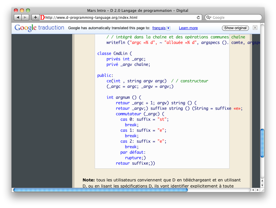
 Posted in reply to Michel Fortin | On 2010-07-02 22:29:04 -0400, Michel Fortin <michel.fortin@michelf.com> said: > http://michelf.com/img/shots/d-website-3.png > > (Note: the last one is quite funny if you can read French, but perhaps also if you can't.) On a side note, I've noticed on other websites that Google Translation doesn't attempt to translate code inside a <code> element. So I would suggest the website uses <pre><code> ... </code></pre> for its code blocks, and <code>...</code> for keywords and other code-related terms in the text. That could actually make the translation useful. -- Michel Fortin michel.fortin@michelf.com http://michelf.com/ | |||
July 03, 2010 Re: D web site facelift | ||||
|---|---|---|---|---|
| ||||
 Posted in reply to Jérôme M. Berger | On Sat, 03 Jul 2010 12:33:10 +0300, Jérôme M. Berger <jeberger@free.fr> wrote: >> Now, what's everyone complaining about font sizes? Except for the >> citation block, the font size looks pretty much the same to me on all >> screenshots (except on Firefox 2.x, where they're slightly smaller - >> you're not using that obsolete browser, are you?). >> > The problem is that font sizes are a personal preference. The main > text of the page should be left at the default in order to pick the > size from the user settings. Uhm, maybe my experience in web applications hasn't taught me much, but AFAIK that's not how browsers work. Instead of having a "default" font value, browsers allow scaling all fonts (or, alternatively, all content including images and plugins) by a user-set coefficient. I suppose you could edit the default browser stylesheet to set a "default" font size, but that would cause inconsistent behavior at best (and will probably break the layout on some websites as well). -- Best regards, Vladimir mailto:vladimir@thecybershadow.net | |||
July 03, 2010 Re: D web site facelift | ||||
|---|---|---|---|---|
| ||||
 Posted in reply to JimBob | On 7/3/2010 5:48 AM, JimBob wrote:
> It's a bit bland, lacking in contrast between the colors. Makes me think of
> the colors of desert camoflage.
What if the gray was changed to black? This would also help the menu contrast. I feel like the orange/red blended with gray looks a little muddy.
| |||
July 03, 2010 Re: D web site facelift | ||||
|---|---|---|---|---|
| ||||
 Posted in reply to Michel Fortin | Michel Fortin wrote:
> On a side note, I've noticed on other websites that Google Translation doesn't attempt to translate code inside a <code> element. So I would suggest the website uses <pre><code> ... </code></pre> for its code blocks, and <code>...</code> for keywords and other code-related terms in the text. That could actually make the translation useful.
This must be new, it didn't use to do that. I'll take advantage of it!
| |||
July 03, 2010 Re: D web site facelift | ||||
|---|---|---|---|---|
| ||||
 Posted in reply to Vladimir Panteleev Attachments:
| Vladimir Panteleev wrote: > On Sat, 03 Jul 2010 12:33:10 +0300, Jérôme M. Berger <jeberger@free.fr> wrote: > >>> Now, what's everyone complaining about font sizes? Except for the citation block, the font size looks pretty much the same to me on all screenshots (except on Firefox 2.x, where they're slightly smaller - you're not using that obsolete browser, are you?). >>> >> The problem is that font sizes are a personal preference. The main >> text of the page should be left at the default in order to pick the >> size from the user settings. > > Uhm, maybe my experience in web applications hasn't taught me much, but AFAIK that's not how browsers work. Instead of having a "default" font value, browsers allow scaling all fonts (or, alternatively, all content including images and plugins) by a user-set coefficient. I suppose you could edit the default browser stylesheet to set a "default" font size, but that would cause inconsistent behavior at best (and will probably break the layout on some websites as well). > Actually, browsers do both. For example in Firefox, you can go to Edit->Preferences->Content on Linux (or Tools->Preferences->Contents on Windows) and you have a pair of fields called "Default Font" and "Default Font Size" which allow setting a default font. Browsers have had this feature since I started using the web in 96. Since a lot of web sites force their own fonts, browsers have added more recently the ability to zoom on a page (and for some browsers, you can even remember the zoom level on a page-by-page basis). But this zoom function is mostly a hack to work around poorly designed web sites. Jerome -- mailto:jeberger@free.fr http://jeberger.free.fr Jabber: jeberger@jabber.fr | |||
July 03, 2010 Re: D web site facelift | ||||
|---|---|---|---|---|
| ||||
Posted in reply to Walter Bright | Walter Bright wrote:
> Michel Fortin wrote:
>> On a side note, I've noticed on other websites that Google Translation doesn't attempt to translate code inside a <code> element. So I would suggest the website uses <pre><code> ... </code></pre> for its code blocks, and <code>...</code> for keywords and other code-related terms in the text. That could actually make the translation useful.
>
> This must be new, it didn't use to do that. I'll take advantage of it!
Sadly, it doesn't work, as it strips all the newlines out, putting your code all on one line. Bah :-(
| |||
July 03, 2010 Re: D web site facelift | ||||
|---|---|---|---|---|
| ||||
Posted in reply to Nick Sabalausky | Nick Sabalausky wrote:
> I didn't see any of the glitchiness or google-translate stuff that other people saw (on IE7, FF2, or Iron). Although, from the screenshot someone else posted of the translate-bar, I'm glad it's not showing up for me. (I really wish people would stop loading up their pages with Google's crap.)
I like the translate widget! I've always been enamored with the idea of a universal translator.
| |||
Copyright © 1999-2021 by the D Language Foundation