
January 14, 2020 Re: Change D's brand color to blue. | ||||
|---|---|---|---|---|
| ||||
 Posted in reply to Alexandru Ermicioi | On Tuesday, 14 January 2020 at 07:36:04 UTC, Alexandru Ermicioi wrote: > On Monday, 13 January 2020 at 20:29:41 UTC, Martin Brezel wrote: >> D-Man looks broken, underevolved and has nothing to do with the planetary(=universal, spacetravel-hightec...) theme... > It perfectly fits in spacetravel scenario. Notice the round shape of D letter as of it is an atmosphere entry shield, :D You mean like the DConf 2018 Logo? (http://dconf.org/2018/images/dconf_logo_2018.jpg). I like this Logo very much as it plays with this space-theme again. On Tuesday, 14 January 2020 at 00:49:49 UTC, Ali Çehreli wrote: > D-Man's bold simplicity always cracks me up. If anything, the site should switch to that bright red. :) Yes, but there is a difference between simple and fragile. If i look at D-Man, i see breaking legs and arms and it hurts me inside :D But serious, D is not "simple" - it is very feature rich and powerful. If you/we/D-Community try to transport a message like "D is simple" using the D-Man, we deem D-Man to exist only as a lie. | |||
 Permalink
 Reply
Reply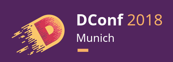
January 14, 2020 Re: Change D's brand color to blue. | ||||
|---|---|---|---|---|
| ||||
 Posted in reply to Martin Brezel | On 1/14/20 1:51 AM, Martin Brezel wrote: > :D You mean like the DConf 2018 Logo? > (http://dconf.org/2018/images/dconf_logo_2018.jpg). I like this Logo > very much as it plays with this space-theme again. It shows how all of us are different: I never liked that logo or its color variants. :) (I don't understand the whole Mars theme either but that's a different matter.) To me, language logos don't mean anything and they really should not mean anything. > On Tuesday, 14 January 2020 at 00:49:49 UTC, Ali Çehreli wrote: >> D-Man's bold simplicity always cracks me up. If anything, the site >> should switch to that bright red. :) > Yes, but there is a difference between simple and fragile. If i look at > D-Man, i see breaking legs and arms and it hurts me inside :D > > But serious, D is not "simple" - it is very feature rich and powerful. I agree. > If you/we/D-Community try to transport a message like "D is simple" > using the D-Man, we deem D-Man to exist only as a lie. To me, D-Man is so ridiculous that it can only be a joke and I love that funny thing about it. I think I enjoy it as a piece of absurdity. :) Ali | |||
January 14, 2020 Re: Change D's brand color to blue. | ||||
|---|---|---|---|---|
| ||||
Posted in reply to Ali Çehreli | On Tuesday, 14 January 2020 at 17:51:18 UTC, Ali Çehreli wrote:
> To me, D-Man is so ridiculous that it can only be a joke and I love that funny thing about it. I think I enjoy it as a piece of absurdity. :)
I agree and I get the humor. But: it is kind of a insider joke - a insider in the public. It's like a programmer telling programmer-jokes in a room with the people from accounting :) IMO logos and mascots is PR-material and as such it should be targeting public, not community.
I do not want to carry this topic too far.. But D-Man hits a nerve :)
| |||
January 15, 2020 Re: Change D's brand color to blue. | ||||
|---|---|---|---|---|
| ||||
 Posted in reply to Martin Brezel | On 14.01.20 21:15, Martin Brezel wrote:
> On Tuesday, 14 January 2020 at 17:51:18 UTC, Ali Çehreli wrote:
>> To me, D-Man is so ridiculous that it can only be a joke and I love that funny thing about it. I think I enjoy it as a piece of absurdity. :)
> I agree and I get the humor. But: it is kind of a insider joke - a insider in the public. It's like a programmer telling programmer-jokes in a room with the people from accounting :) IMO logos and mascots is PR-material and as such it should be targeting public, not community.
>
> I do not want to carry this topic too far.. But D-Man hits a nerve :)
It is my opinion that we do not need to market towards people who would be thrown off by D-man.
| |||
January 15, 2020 Re: Change D's brand color to blue. | ||||
|---|---|---|---|---|
| ||||
 Posted in reply to James Lu | On Monday, 13 January 2020 at 04:21:54 UTC, James Lu wrote: > > Red is associated with ... [snip] > In contrast, blue reflects ... The D'mand that D-man be D'monized like he is some kind of D'monstrable red piece of Rust is just plain D'meaning. D'mmit! To paraphrase Andrei... this is all about bikeshedding and once "D-man is up for (re)painting, the rainbow won't suffice!". | |||
January 20, 2020 Re: Change D's brand color to blue. | ||||
|---|---|---|---|---|
| ||||
 Posted in reply to ShadoLight | I think the color red is fine. It sands out and feels nice and warm. If you want do marketing and be creative then invent a proper mascot. Something which can be made out of plush so you can hand them out at conferences. I got a chameleon from SUSE. I don't even like SUSE. But it is a nice plush toy and it is a good remainder that it exists. SUSE chameleon: https://suseus.quickorder.uk.com/products/name/small-suse-chameleon/product_id/5500266000108?size=&start= Common Lisp mascot: http://missingfaktor.blogspot.com/2012/07/tour-through-land-of-lisp.html http://www.lisperati.com/lisplogo_warning2_256.png | |||
January 20, 2020 Re: Change D's brand color to blue. | ||||
|---|---|---|---|---|
| ||||
 Posted in reply to Jan Hönig | On Monday, 20 January 2020 at 10:06:13 UTC, Jan Hönig wrote:
> I think the color red is fine. It sands out and feels nice and warm.
>
> If you want do marketing and be creative then invent a proper mascot.
> Something which can be made out of plush so you can hand them out at conferences.
> I got a chameleon from SUSE. I don't even like SUSE. But it is a nice plush toy and it is a good remainder that it exists.
>
> SUSE chameleon: https://suseus.quickorder.uk.com/products/name/small-suse-chameleon/product_id/5500266000108?size=&start=
>
> Common Lisp mascot: http://missingfaktor.blogspot.com/2012/07/tour-through-land-of-lisp.html
> http://www.lisperati.com/lisplogo_warning2_256.png
No mascot, no Mascot, NO MASCOT. Let's not go in those immature territories. If you want to products for companies, then I suggest that you buy something useful and put the D logo on it and perhaps a link to the site. It can for example be an airplane pillow or a cup. Then people will use that product and be reminded of D instead of some plush toy that will end up in a drawer.
If you don't like the D-man, it can removed quickly as it is used very seldom. It is just once on this site what I've seen. It is pretty harmless.
Just for comparison, one of the most successful multi billion profit companies has four squares as logo chucked together for its main product. You can really keep things simple.
| |||
January 21, 2020 Re: Change D's brand color to blue. | ||||
|---|---|---|---|---|
| ||||
 Posted in reply to IGotD- | On Monday, 20 January 2020 at 11:09:59 UTC, IGotD- wrote:
>
> No mascot, no Mascot, NO MASCOT. Let's not go in those immature territories.
Like Tux, or Beastie, or Freddie Mailchip, or that Android Robot?
For what its worth, as a hobbyist, I have no issue at all with the red.
| |||
January 21, 2020 Re: Change D's brand color to blue. | ||||
|---|---|---|---|---|
| ||||
 Posted in reply to IGotD- | On Monday, 20 January 2020 at 11:09:59 UTC, IGotD- wrote:
> Just for comparison, one of the most successful multi billion profit companies has four squares as logo chucked together for its main product. You can really keep things simple.
I think most of this discussion is just harmless fun.
D's branding, color, logo, even the design of the front page isn't the reason for it's relatively low adoption rate.
| |||
January 22, 2020 Re: Change D's brand color to blue. | ||||
|---|---|---|---|---|
| ||||
 Posted in reply to JN | On 22/01/2020 12:02 AM, JN wrote:
> On Monday, 20 January 2020 at 11:09:59 UTC, IGotD- wrote:
>> Just for comparison, one of the most successful multi billion profit companies has four squares as logo chucked together for its main product. You can really keep things simple.
>
> I think most of this discussion is just harmless fun.
>
> D's branding, color, logo, even the design of the front page isn't the reason for it's relatively low adoption rate.
We should only do it, if we wanted to do a full rebranding.
Like say making @safe by default.
| |||
Copyright © 1999-2021 by the D Language Foundation