
January 22, 2016 Re: [dlang.org] Let's talk about the logo | ||||
|---|---|---|---|---|
| ||||
 Posted in reply to WebFreak001 | On 22.01.2016 15:44, WebFreak001 wrote: > However I dont have an SVG for that and I basically just used the logo > from the imgur screenshot, cut of a rounded rectangle (5px border > radius) and added a simple box shadow (0px 1px 3px rgba(0,0,0,0.3)) Here's the SVG. Go crazy. https://gist.github.com/anonymous/421e80748f1c885f7620 | |||
 Permalink
 Reply
ReplyJanuary 22, 2016 Re: [dlang.org] Let's talk about the logo | ||||
|---|---|---|---|---|
| ||||
 Posted in reply to anonymous | On Friday, 22 January 2016 at 15:25:25 UTC, anonymous wrote: > Here's the SVG. Go crazy. > > https://gist.github.com/anonymous/421e80748f1c885f7620 (First I have fixed these weird curves on the D's bottom left and top left corner.) OK I have cropped it now and also tried to add a slight box shadow to it. https://i.imgur.com/r9WPvEX.png At the top left its just the cropped version on a "D-red" background. On the other 3 corners its the cropped version with a slight box shadow on various backgrounds. The version with the box shadow could be used as application icon for example. | |||
January 22, 2016 Re: [dlang.org] Let's talk about the logo | ||||
|---|---|---|---|---|
| ||||
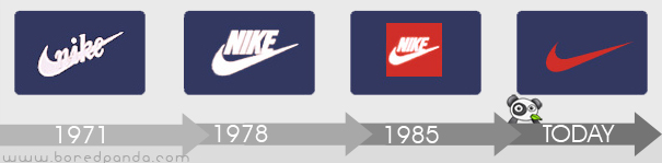
 Posted in reply to anonymous | On Thursday, 21 January 2016 at 23:46:26 UTC, anonymous wrote: > The logo is repeatedly being called out as a weak spot of the D brand. But so far Walter has been adamant about keeping it the way it is. > > I agree with him that changing it to a completely different one would probably not be a good move, losing whatever brand recognition we have. But I think we should adapt the logo to the needs at hand. > > It's obvious to me that the D and the moons (the two circles to the upper right of the D) make the recognizable core of the logo. I know that others see it the same way. That means, the D and the moons should be kept intact. Their shapes and positions should not change. > > However, I believe we can take away a lot of the decorations of the current logo, and it will still be recognized immediately as the same brand. > > Here's a little progression of simplifications, in the context of dlang.org: > > http://i.imgur.com/eJaKFtx.png > > The first one is the current logo. The last one shows just the core shape (D + moons), of course. > > I'm not nearly the first one to do this, but I'd like to propose adopting the core shape as the official logo. Then specify some specific shade of red as the official brand color. (We're using #B03931 on dlang.org.) > > We could provide multiple variants of the logo for different use cases, and with varying levels of decoration: > > * Core shape in different color combinations (black one white, red on white, white on red). > * Versions that include the background arc (I'm interpreting that as Mars), possibly in different colors. > * The full version with border and shadow. I.e. the current logo with adjusted colors, and maybe some details changed, like number of borders or amount of shininess. > > For dlang.org, I'd choose the version with the wide background arc. I think it looks nice on the menu bar, and it puts a little more emphasis there than just the core shape. But just the core shape looks fine, too. This is something I've been vocal about before. The logo should stay the same but you do have artistic license to play with the structure. For example the third from the top of this image http://i.imgur.com/eJaKFtx.png is perfectly acceptable because the logo is intact, it's just used in a slightly different way. Think of the nike tick and how it has changed and been used over the years but it's always a tick. http://lh3.ggpht.com/_9F9_RUESS2E/SxploMIEQjI/AAAAAAAABuc/EcOJ2hPM7PY/s800/logo-evolution-brand-companies-nike-swoosh.jpg | |||
January 22, 2016 Re: [dlang.org] Let's talk about the logo | ||||
|---|---|---|---|---|
| ||||
 Posted in reply to WebFreak001 | On Friday, 22 January 2016 at 15:48:04 UTC, WebFreak001 wrote:
> On Friday, 22 January 2016 at 15:25:25 UTC, anonymous wrote:
>> Here's the SVG. Go crazy.
>>
>> https://gist.github.com/anonymous/421e80748f1c885f7620
>
> (First I have fixed these weird curves on the D's bottom left and top left corner.)
>
> OK I have cropped it now and also tried to add a slight box shadow to it.
>
> https://i.imgur.com/r9WPvEX.png
>
> At the top left its just the cropped version on a "D-red" background. On the other 3 corners its the cropped version with a slight box shadow on various backgrounds. The version with the box shadow could be used as application icon for example.
I think the padding on the top and bottom need to be the same as on the left and right. Looks good otherwise. I don't like the top-left option but all three of the others look good on their backgrounds.
| |||
January 22, 2016 Re: [dlang.org] Let's talk about the logo | ||||
|---|---|---|---|---|
| ||||
Posted in reply to WebFreak001 | On 22.01.2016 16:48, WebFreak001 wrote:
> (First I have fixed these weird curves on the D's bottom left and top
> left corner.)
What's weird about them? As far as I see, you made the corners more pointed, though it's hard to tell at that size. I'm not sure if that's an improvement.
| |||
January 22, 2016 Re: [dlang.org] Let's talk about the logo | ||||
|---|---|---|---|---|
| ||||
Posted in reply to anonymous | On Friday, 22 January 2016 at 19:00:41 UTC, anonymous wrote: > On 22.01.2016 16:48, WebFreak001 wrote: >> (First I have fixed these weird curves on the D's bottom left and top >> left corner.) > > What's weird about them? As far as I see, you made the corners more pointed, though it's hard to tell at that size. I'm not sure if that's an improvement. Original: https://i.imgur.com/6M1Eoy2.png Fixed: https://i.imgur.com/uLuUgJY.png | |||
January 22, 2016 Re: [dlang.org] Let's talk about the logo | ||||
|---|---|---|---|---|
| ||||
Posted in reply to WebFreak001 | On 22.01.2016 20:08, WebFreak001 wrote:
> Original: https://i.imgur.com/6M1Eoy2.png
>
> Fixed: https://i.imgur.com/uLuUgJY.png
:D
Yeah, uhm, that's totally an improvement, of course.
| |||
January 22, 2016 Re: [dlang.org] Let's talk about the logo | ||||
|---|---|---|---|---|
| ||||
 Posted in reply to anonymous | On Thursday, 21 January 2016 at 23:46:26 UTC, anonymous wrote:
> The logo is repeatedly being called out as a weak spot of the D brand. But so far Walter has been adamant about keeping it the way it is.
I certainly agree the logo is weak, to me the planets look more like a bad lens flare effect unfortunately. The bottom reflection bit needs to be removed but I think the planets/moons need to be spaced away from the D. The bigger dot overlapping the D just looks messy, like a misplaced paint blotch.
| |||
January 22, 2016 Re: [dlang.org] Let's talk about the logo | ||||
|---|---|---|---|---|
| ||||
 Posted in reply to anonymous | On Thursday, 21 January 2016 at 23:46:26 UTC, anonymous wrote:
> The logo is repeatedly being called out as a weak spot of the D brand. But so far Walter has been adamant about keeping it the way it is.
I don't want to start a war, but this isn't community? I mean aren't we trying to make things better, because the way you said it seems like a dictatorship.
| |||
January 22, 2016 Re: [dlang.org] Let's talk about the logo | ||||
|---|---|---|---|---|
| ||||
Posted in reply to ronaldmc | On Friday, 22 January 2016 at 19:53:32 UTC, ronaldmc wrote:
> On Thursday, 21 January 2016 at 23:46:26 UTC, anonymous wrote:
>> The logo is repeatedly being called out as a weak spot of the D brand. But so far Walter has been adamant about keeping it the way it is.
>
> I don't want to start a war, but this isn't community? I mean aren't we trying to make things better, because the way you said it seems like a dictatorship.
I think a fair explanation would be that it's a meritocracy of effort and ability. Walter has put an enormous amount of effort into D over a long period and therefore his view holds great sway. It's a good system for a project like this generally though it falls down a bit on issues that are more personal preference than technical.
| |||
Copyright © 1999-2021 by the D Language Foundation